2022
Popit Recycle
Product Design, UX/UI Design
UX Designer
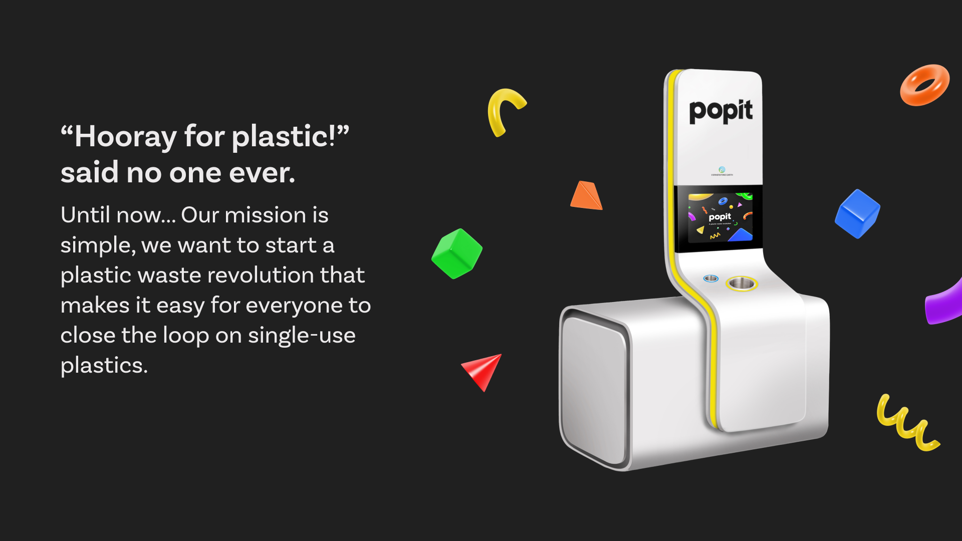
Recycling plastic in Australia can be confusing, disheartening, and mundane.
How can we create a system that is transparent, fun, and actually works, so that people can love recycling?
Stakeholder workshop
Feature ideation
Screen flows, light and sound designs
Testing
Client communication
UI Designer handoff
First, I flew to Melbourne for a kickoff stakeholder workshop to ensure that everyone was aligned on product and project vision. We gained an understanding of the business structure and machine mechanics, and synthesised our findings with the wider project team.
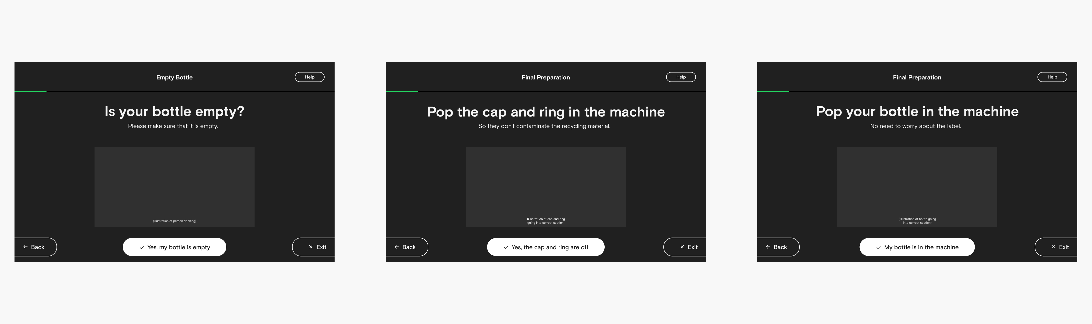
Then I brainstormed playful ideas and established 'first release' and 'second release' flows for screens. I sketched low-fidelity prototypes and iterated on them repeatedly. I collaborated closely with one stakeholder and responded to feedback live on our shared Figma file.
Finally, I created prototypes on Figma, tested them, and presented them to our clients. Once they were approved, I worked with our UI team to make their lives as easy as possible!

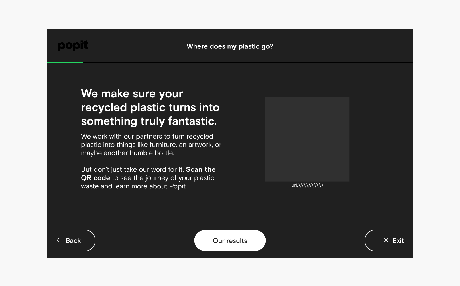
Research showed that there is a lack of transparency surrounding Australia's recycling process, and many people are dubious about whether their carefully sorted plastics are actually recycled.
Very little of the plastic that we attempt to recycle is actually recycled.
Working with the engineers, I designed lights and sounds to come on when interactions were completed. Playfulness and guidance were important parts of the interaction, for example, a celebratory noise and lights created a moment of joy.
The machines will be rolled out to corporate buildings and schools. This meant that the design had to be accessible - I kept interactions at the bottom to accomodate various heights of recyclers and our UI designer created illustrations that ensured you didn't need to read to be able to use the machine.
Throughout the design project, it was crucial to collaborate and negotiate with the client to ensure that their vision was being honoured while keeping the customers in mind. For example, the client wanted a live video feed of objects being shredded, but I had to consider a main user demographic - school children- and their potential misuse of the feature.
To understand their perspective, I talked to school kids who shared their... let's call it: creative-use cases and concerns, which helped us come up with a more suitable solution. We ultimately created a cute and fun animation of plastic being shredded, which was a nice middle ground everyone was happy with.
Finally, I learned that education and transparency are essential when it comes to promoting sustainability. Including informational pieces and notifications about the reuse of recycled plastic helped users feel more connected to the recycling process and understand the impact of their actions.

